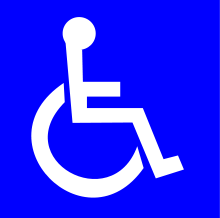
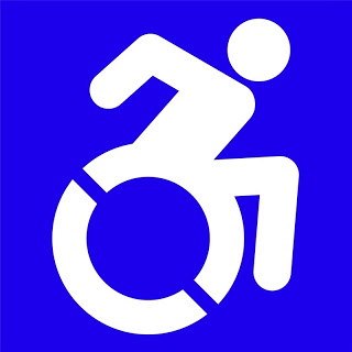
Moving forward from a static and ubiquitous “handicapped” symbol – a blue and white logo of a person leaning back in a wheelchair known as the international symbol of access , which has been under fire from disability activists who feel the logo paints disabled people as passive – the New York City has adopted a new international symbol of access.
 Organization (ISO), and the symbol is generally placed wherever access has been improved for people with disability issues. It was first designed by Susanne Koefoed in 1968 – although she didn’t give the symbol a head. That was added a while later by Karl Montan.
The project has been pushing for an update to the symbol, one that is more modern, and that depicts a more active figure. According to the group, the original design focused too much on the wheelchair, rather than the person who’s sitting in it, and depicts that person as stiff and passive.
They say this is representative of the treatment that many people with disabilities have faced. “People with disabilities have a long history of being spoken for, of being rendered passive in decisions about their lives,” expresses the the group on its website.
![In the beginning of their project, Sara Hendren & Brian Glenney stuck their new design over existing handicapped signs around Boston in a little guerrilla marketting [photo credits Darcy Hildreth - npr.org] In the beginning of their project, Sara Hendren and Brian Glenney stuck their new design over existing handicapped signs around Boston.](http://media.npr.org/assets/img/2013/06/07/handicap-sign-9d8f34a14469996ea8963815aacbf8667417a37b-s3.jpg)

1 – Head Position
Head is forward to indicate the forward motion of the person through space. Here the person is the “driver” or decision maker about her mobility.
2 – Arm Angle
Arm is pointing backward to suggest the dynamic mobility of a chair user, regardless of whether or not she uses her arms. Depicting the body in motion represents the symbolically active status of navigating the world.
3 – Wheel Cutouts
By including white angled knockouts the symbol presents the wheel as being in motion. These knockouts also work for creating stencils used in spray paint application of the icon. Having just one version of the logo keeps things more consistent and allows viewers to more clearly understand intended message.
4 – Limb Rendition
The human depiction in this icon is consistent with other body representations found in the ISO 7001 – DOT Pictograms. Using a different portrayal of the human body would clash with these established and widely used icons and could lead to confusion.
5 – Leg Position
The leg has been moved forward to allow for more space between it and the wheel which allows for better readability and cleaner application of icon as a stencil.
Sources: The Verge; LaughingSquid; npr; Accessible Icon Project
